Jewish Woman and Design in the Modern Era
The exhibition “Widerstände – Defiance. Jewish Women and Design in the Modern Era” at the Jewish Museum Berlin presents the lives and work of more than 60 female designers. It shows how they overcame social barriers to fight for change and visibility – and how they paved the way for other women. We designed the graphics, scenography, and architecture for the special exhibition.
Jüdisches Museum Berlin Jewish Woman and Design in the Modern Era 2025
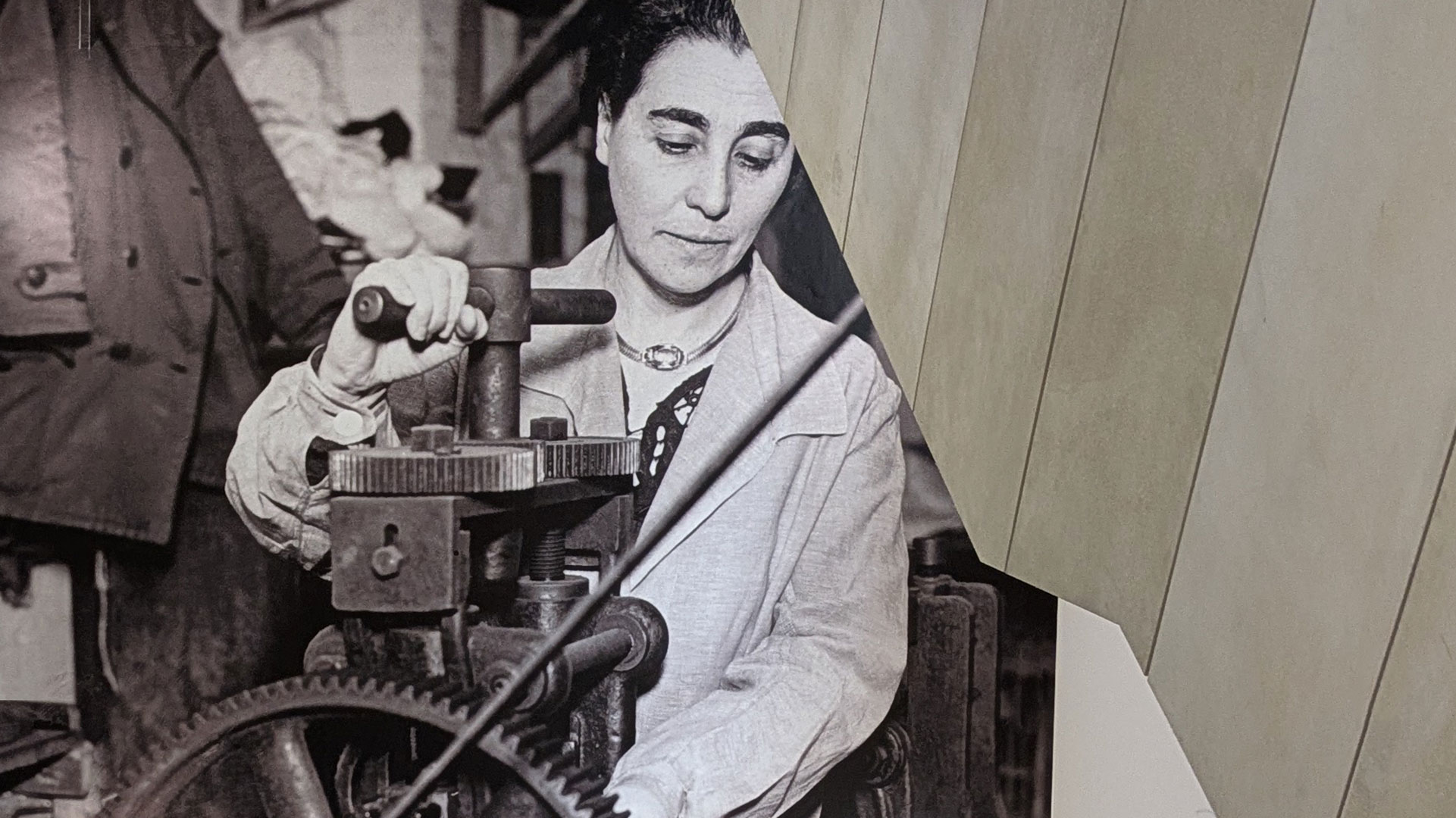
The exhibition is based on intensive research into the lives and work of Jewish female designers of the modern era. This foundation brings their biographies, working environments, and struggles for recognition to light—and anchors them in cultural memory. The exhibition is told in 10 chapters. From female designers as “pioneers” against social, ideological, and legal resistance, to their “training and design” during and after the exclusion of women from art academies, to “Into the Dark,” against the violence and pressure of the Nazi regime. “New Realities” deals with the time of new beginnings for survivors after the war
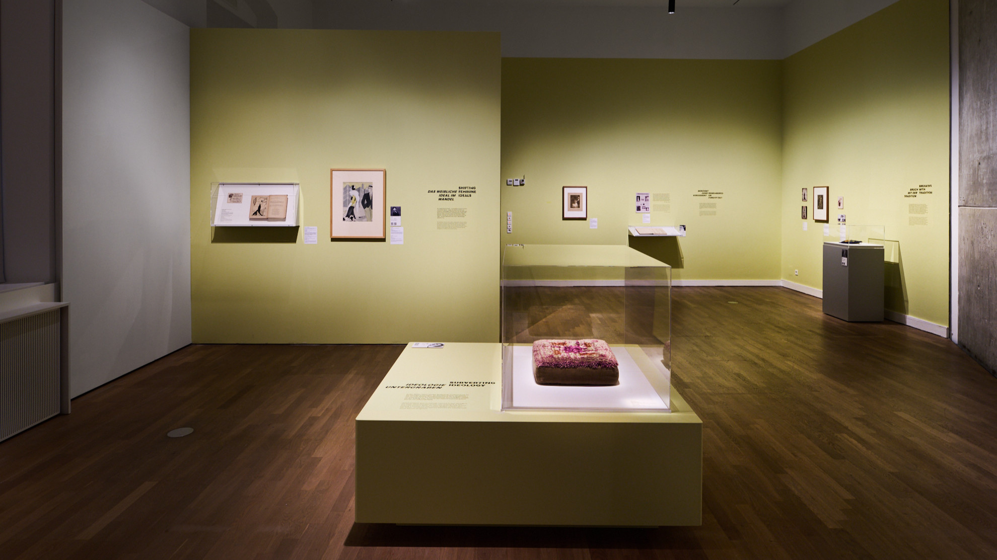
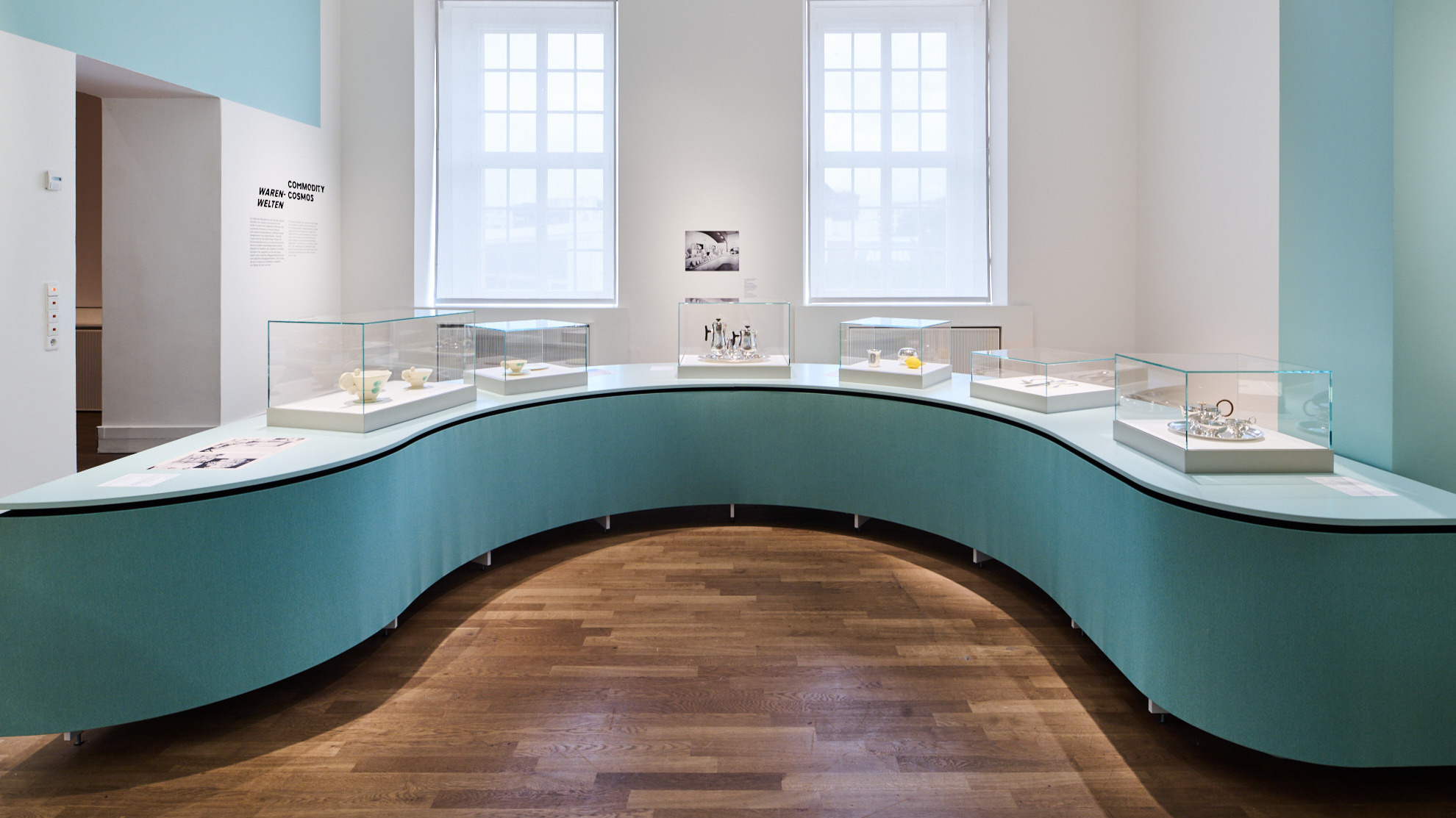
The scenographic concept puts the designers front and center: their names, faces, and designs feature prominently throughout the exhibition. The themed rooms are divided by floor-to-ceiling wall graphics in monumental zigzag shapes. This gives the designers’ assertiveness a new, physically tangible presence.
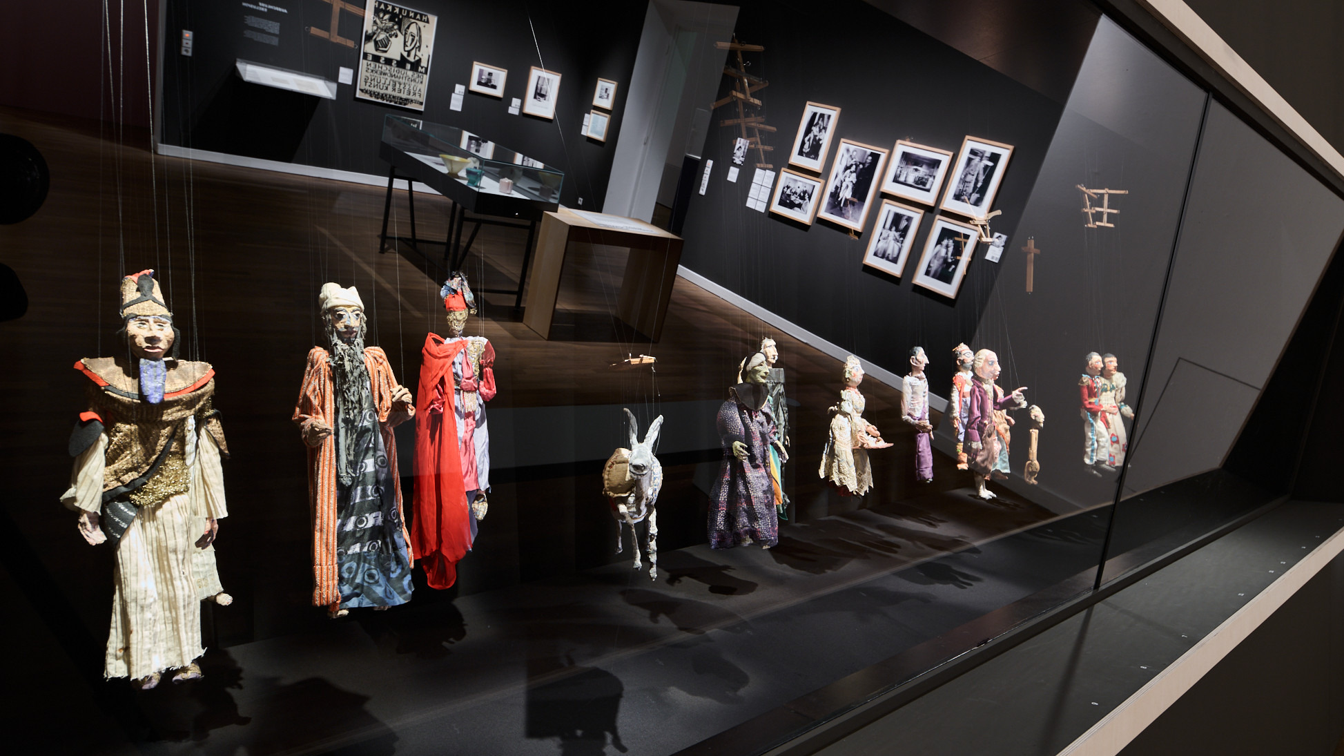
The exhibition showcases female designers from the fields of fashion, graphic design, architecture, arts and crafts, and product design. The spatial dramaturgy creates a panorama of their diversity and influence on modernity – impressively condensed into 900 square meters in the old building of the JMB.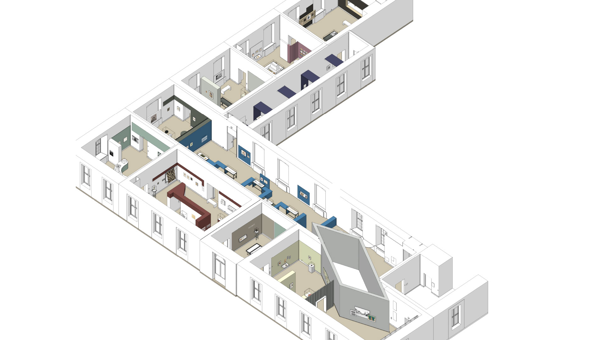
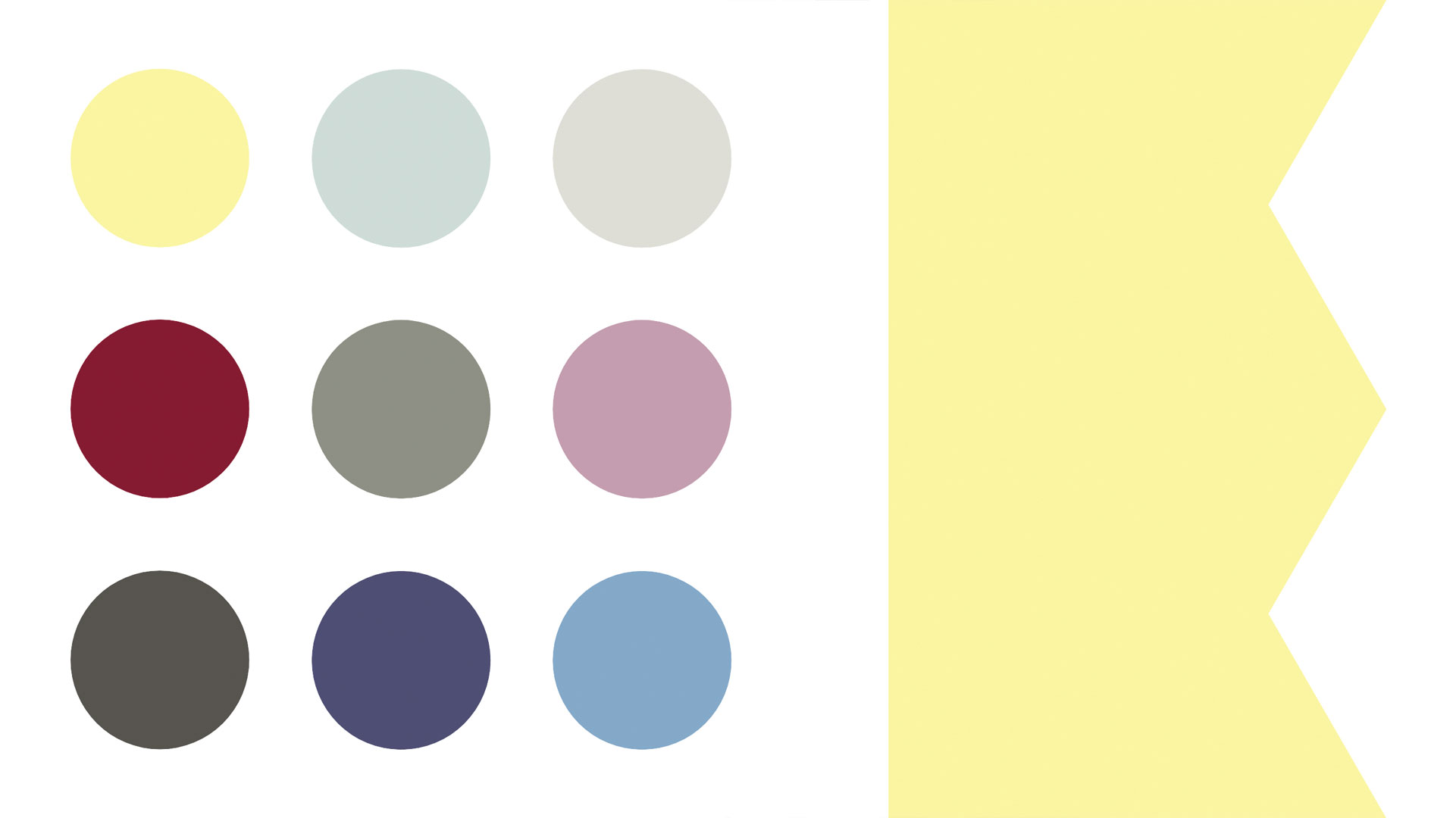
Each chapter of the exhibition has its own color scheme, which aids orientation and visually highlights the differences in content. The palette ranges from powerful contrasts to subtle tones—a subtle choreography of themed rooms.
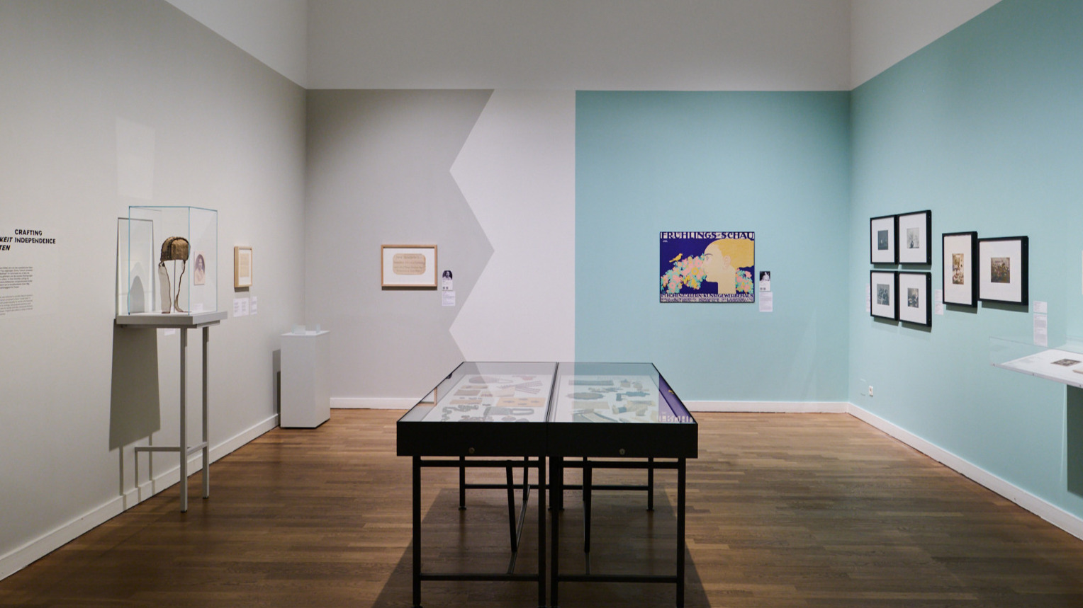
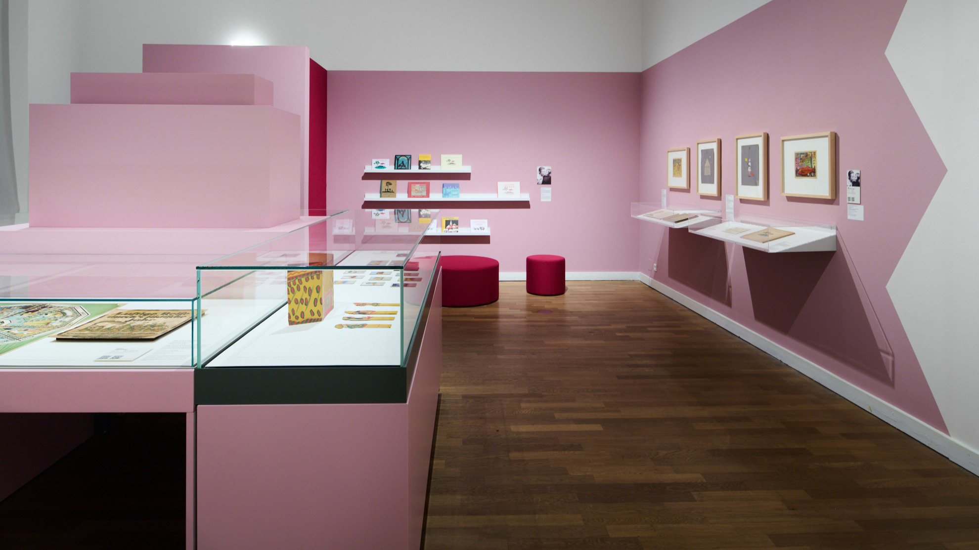
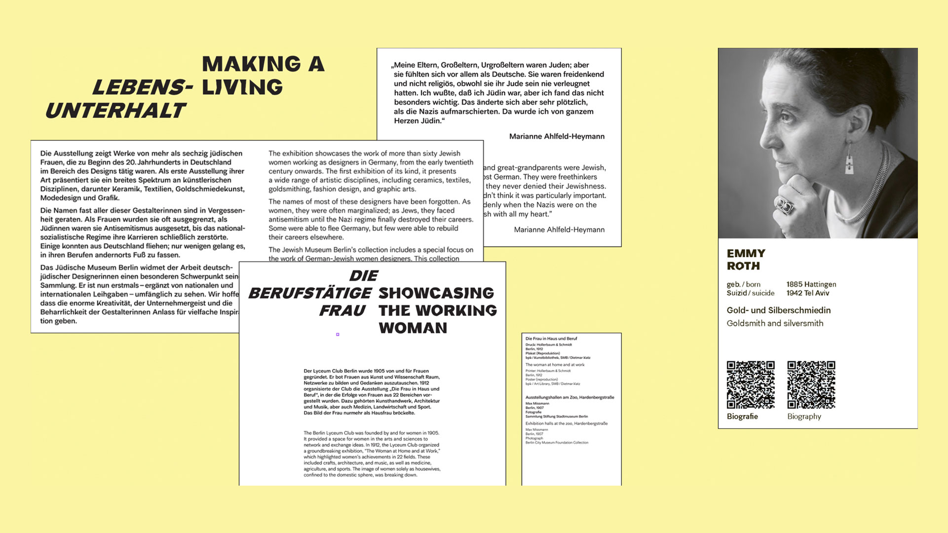
Analog and digital communication intertwine: QR codes and links lead to in-depth biographies on the JMB website. This allows visitors to experience each designer individually, while the on-site exhibition reveals the collective dimension of their history.
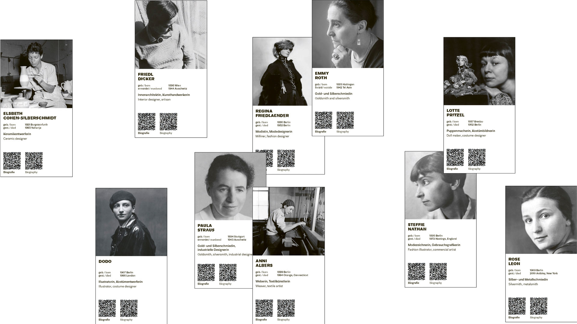
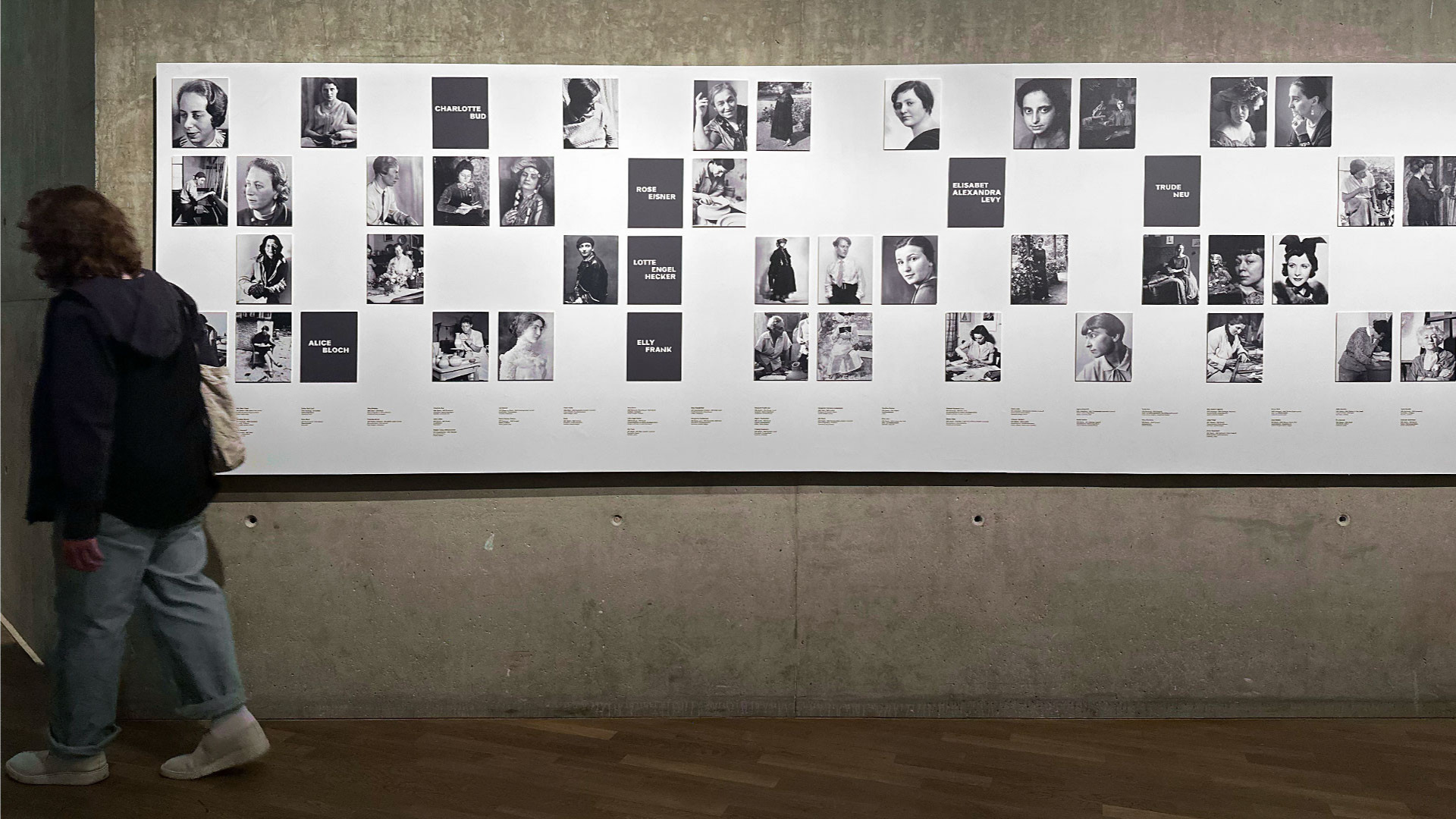
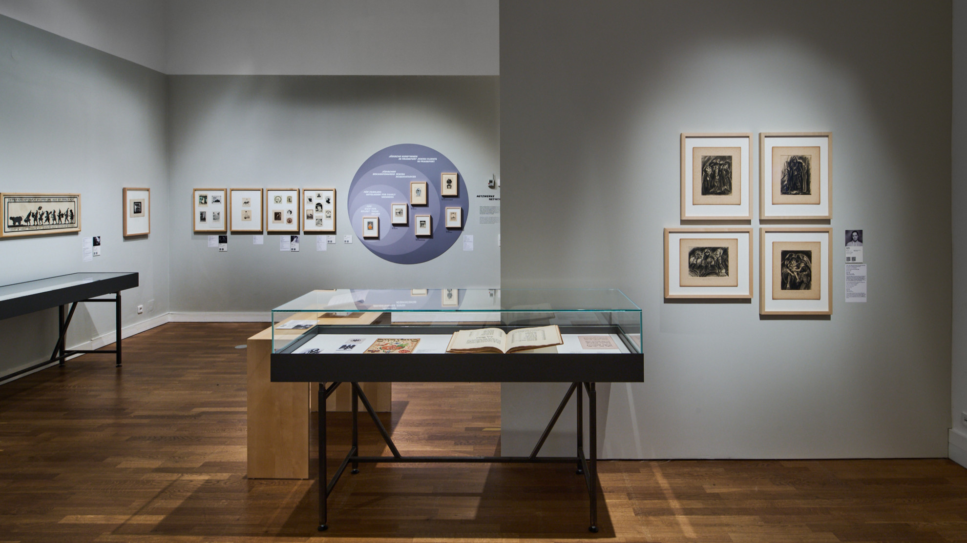
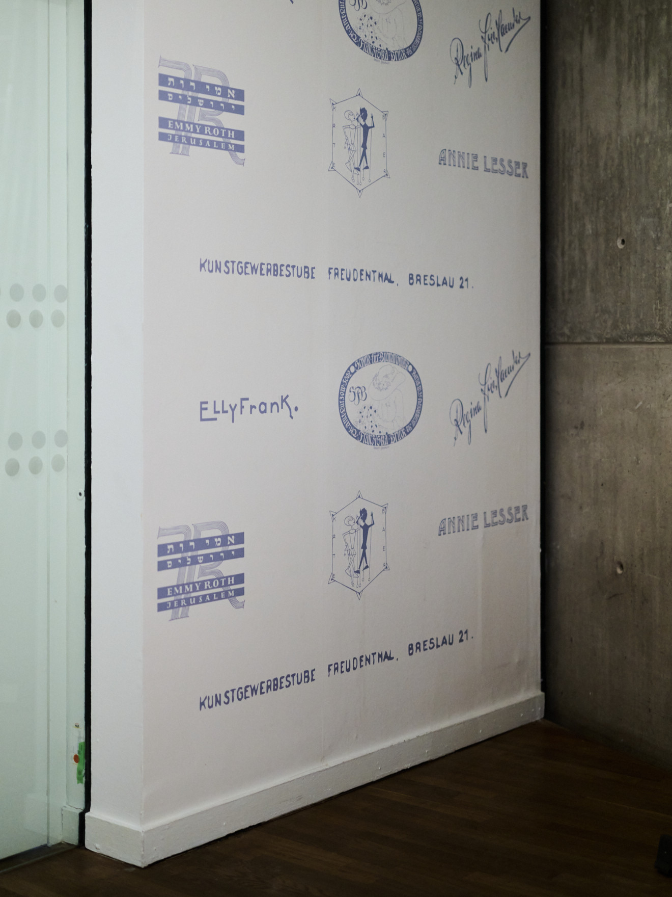
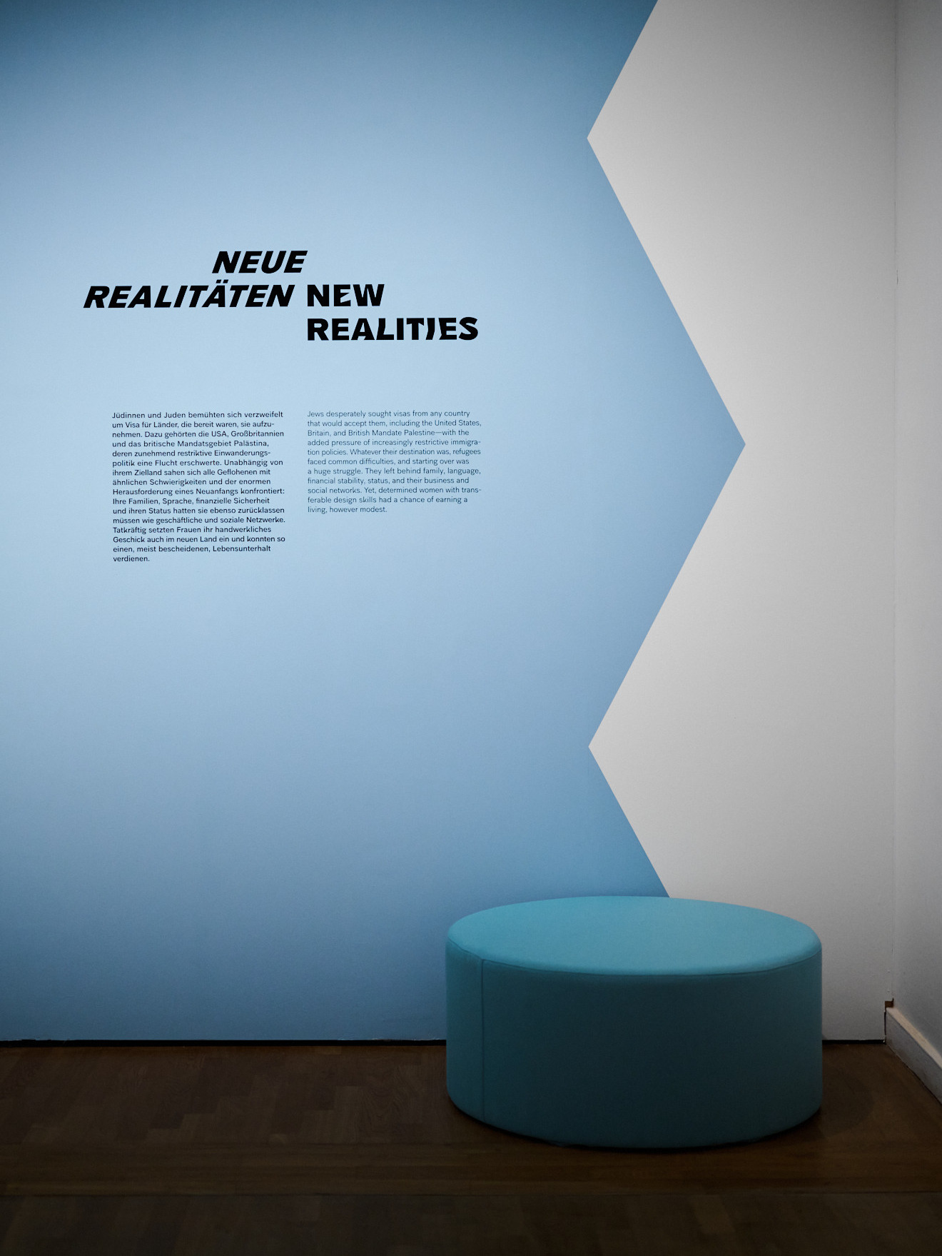
A precise system of Super-A, A, B, and C texts provides orientation: from introductory guiding principles to chapter texts to object information. The clear structure guides visitors through the exhibition without distracting them from the designers and their works.
The JMB’s corporate font has been deliberately broken up: distortions and resistances set creative accents that reflect the obstacles in the designers’ lives. In this way, typography becomes a narrative level that not only informs, but also makes the historical narrative tangible.
The texts are printed on black velvet—a material that recalls the feel of handcrafted surfaces. The soft, dense structure creates a sensual depth, reinforces the value of the exhibition, and combines precision of content with emotional impact.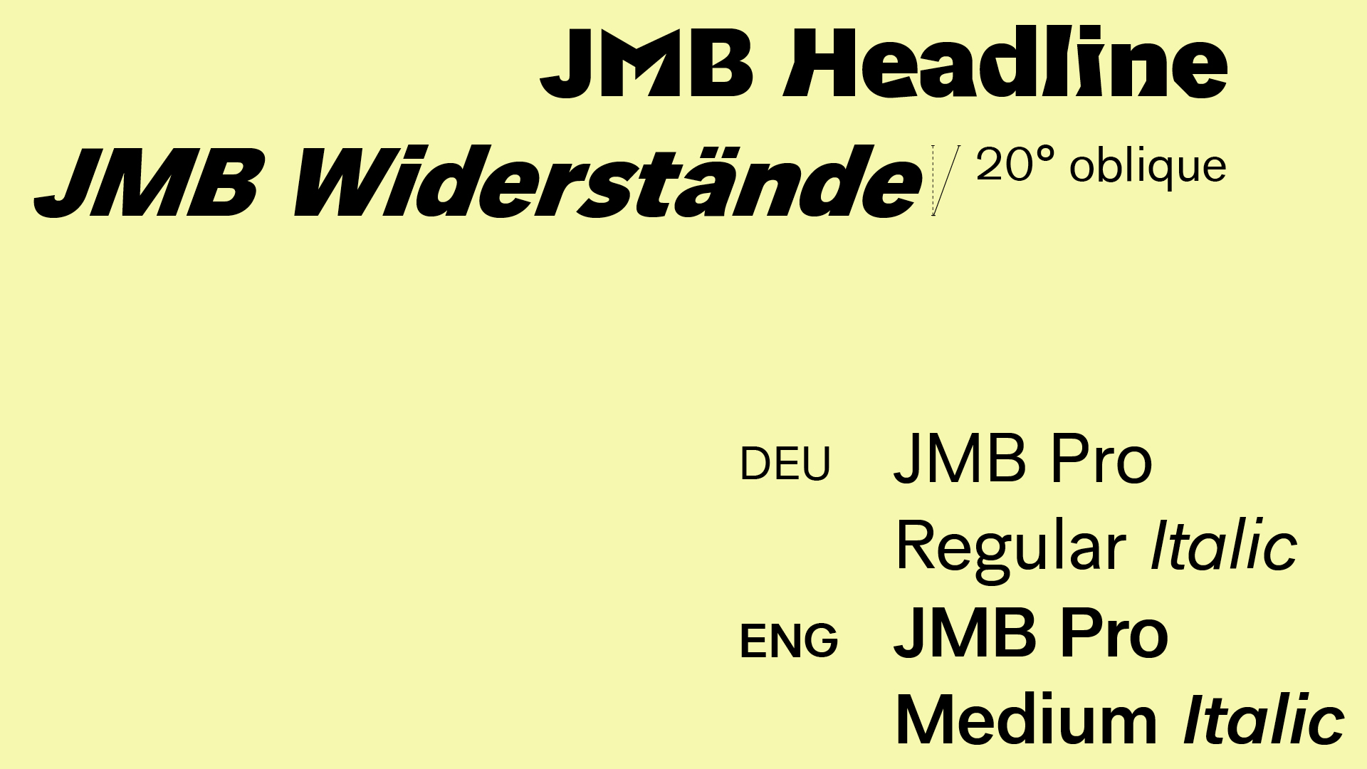
Thanks to our partners!
The exhibition design was developed in collaboration with:Thilo Albers
Production management:
Valerie Daude
Exhibition views by:
Yves Sucksdorff
Take a look at another project with the Jewish Museum Berlin:
Paris Magnétique


