binnenstadt – Bremen City Transformation
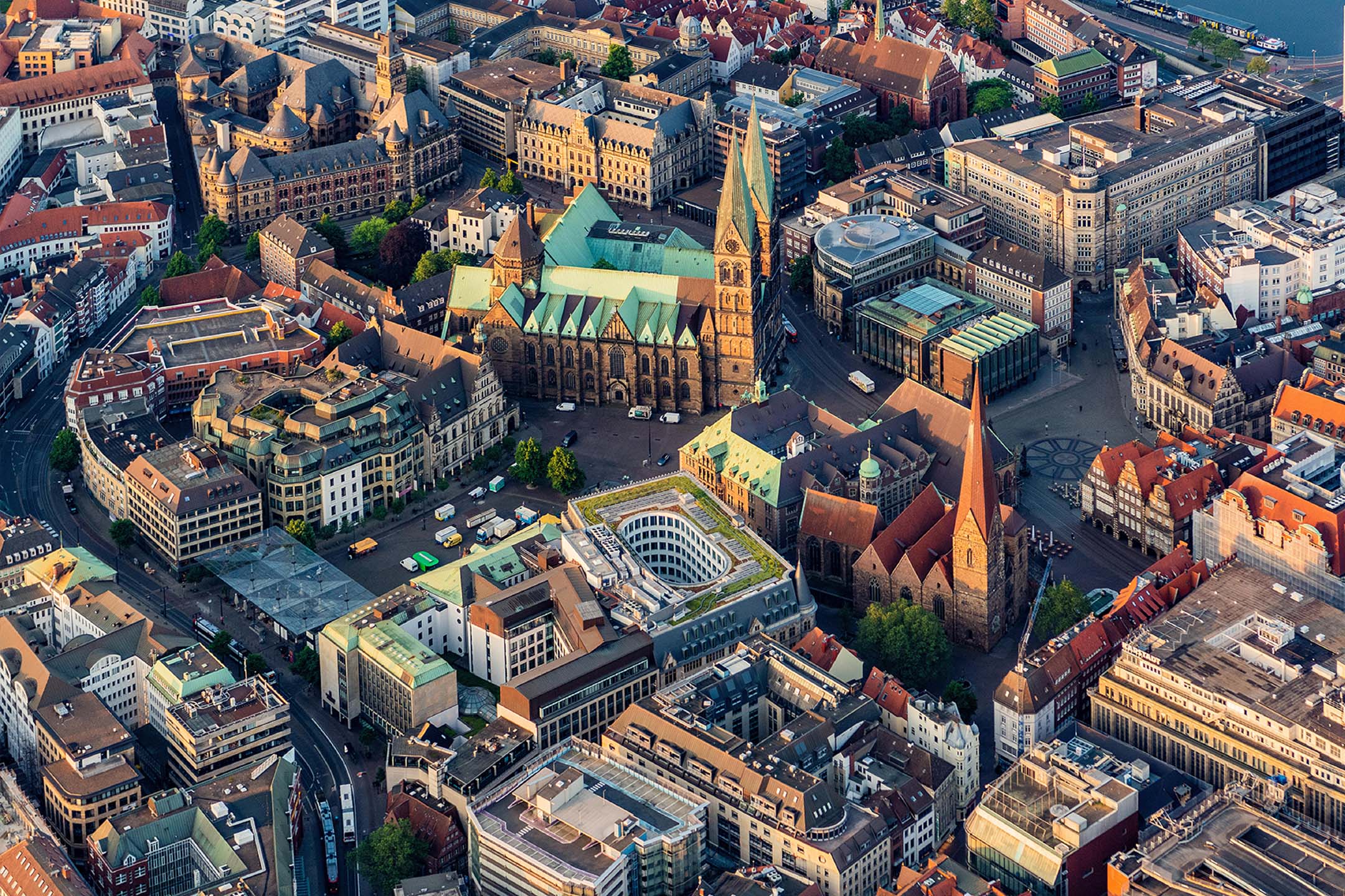
Bremen’s city center between the recreation area “Wallanlagen” and the river Weser is changing. And not just since yesterday. Social, economic and ecological issues are colliding in a very confined space. “Projektbüro Innenstadt Bremen” (Bremen City Centre Project Office) coordinates between the various players. Together with the team, we have developed the communication strategy for the “binnenstadt”. This goes right to the heart of the people of Bremen.
Projektbüro Innenstadt Bremen
binnenstadt – Bremen City Transformation
2023-ongoing
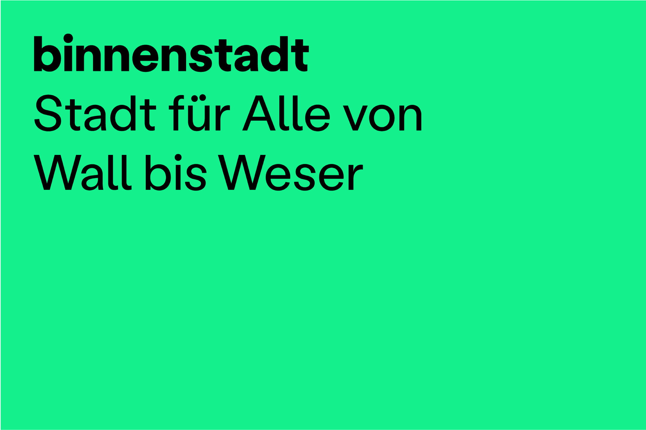
A lot of attention is being paid to communication in Bremen’s city center. The topics are the focus of various stakeholders, each with a different emphasis. Everything comes together in the big topic of transformation. In order to give this complexity a simple but emotionally connectable face, we have developed an umbrella brand for inner city communication: The term binnenstadt is composed of the Bremen merchants’ motto “buten un binnen, wagen un winnen” (outside and inside, dare and win).
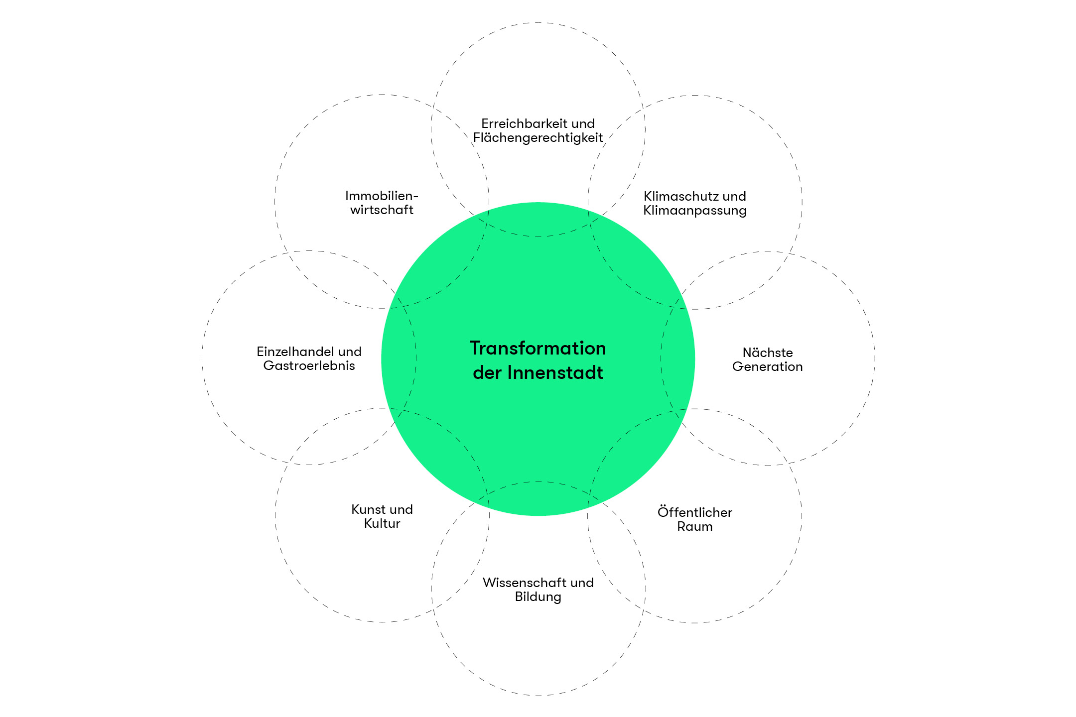
To meet the challenges of change, you need courage and desire. Both are difficult to conjure up. Action is required. But concrete change requires ideas and money. The Bremen City Center Project Office connects entrepreneurs with business development and the real estate sector. A new variety of uses is emerging, making the structure of the city center more resilient to disruption. The public space is given more quality of life. Large properties and vacant first floors are given a new mix of uses including education, retail and gastronomy. Creative entrepreneurs, so-called city makers and owners cooperate with the city for new concepts that make the city center usable after hours. Streets are being converted to be climate-friendly. The city center has an impact beyond its borders.
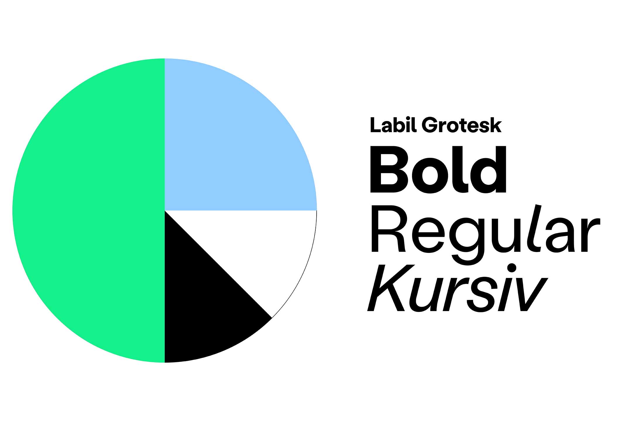
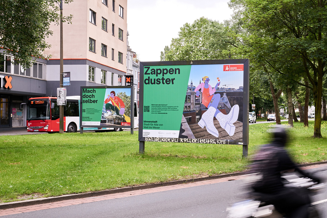
The color scheme is based on green and blue areas, which will be decisive for a sustainable Bremen city center. Black can be used in combination with the two colors to create an elegant, serious or urban effect. The corporate typeface Labil Grotesk (KOMETA) is stable and at the same time exudes a subtle uniqueness.

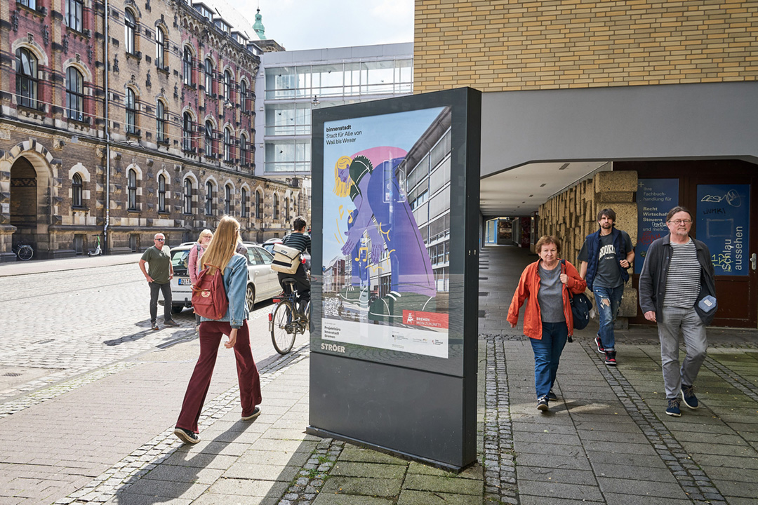
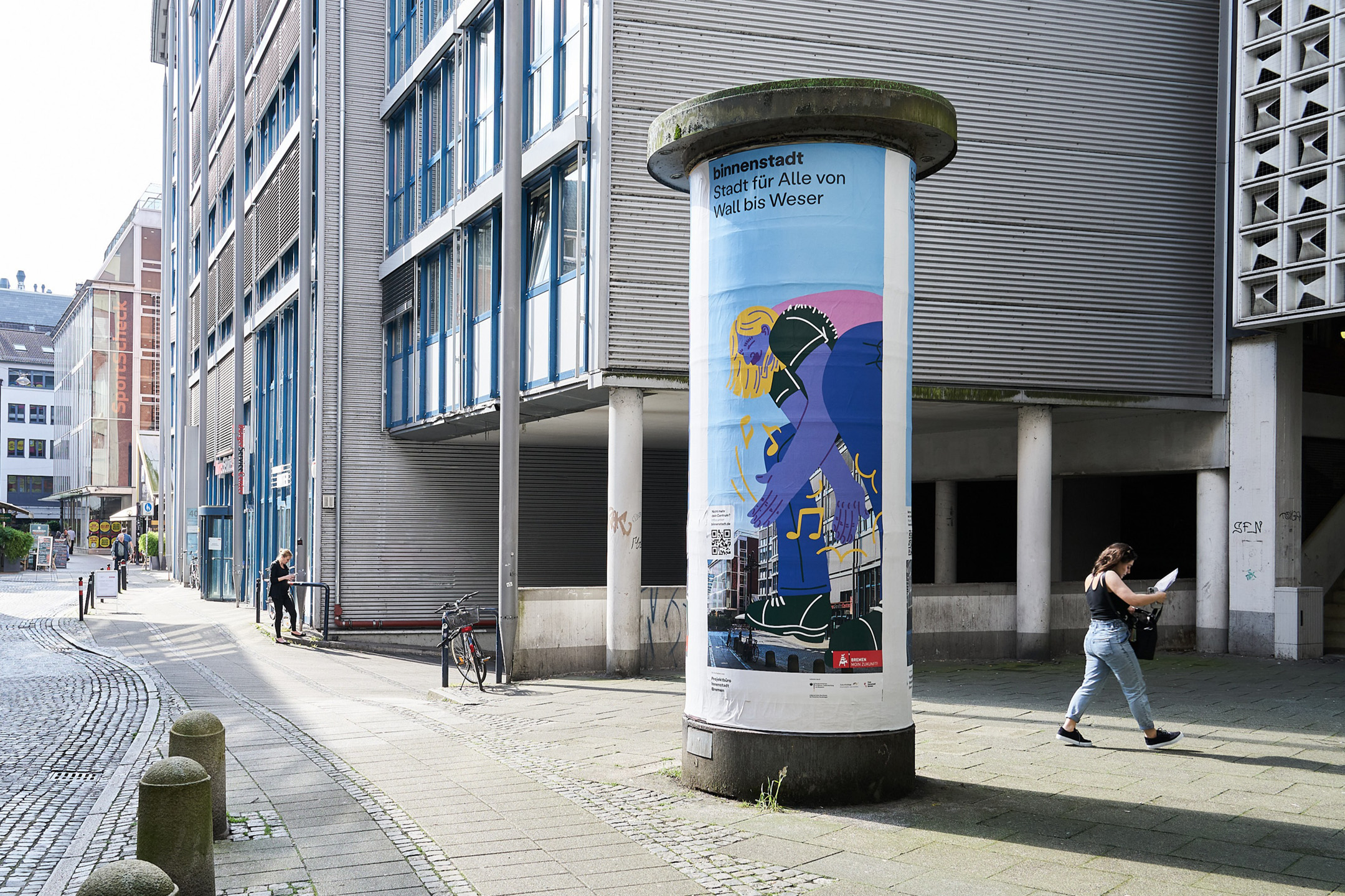
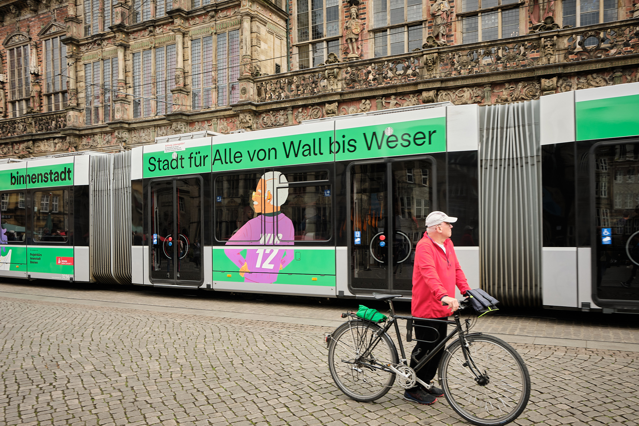
Our aim for the campaign creation was to connect the power of each of the actors with local places of transformation. Montages of photos of well-known and little-known places in Bremen’s city center form a visual connection with illustrated figures. The “Transformers” stand for the new diversity of use that the project office makes possible. They can be owners here, citizens or entrepreneurs there. We combined architectural photographs by Christian Burmester with character designs by Viktoria Cichoń.
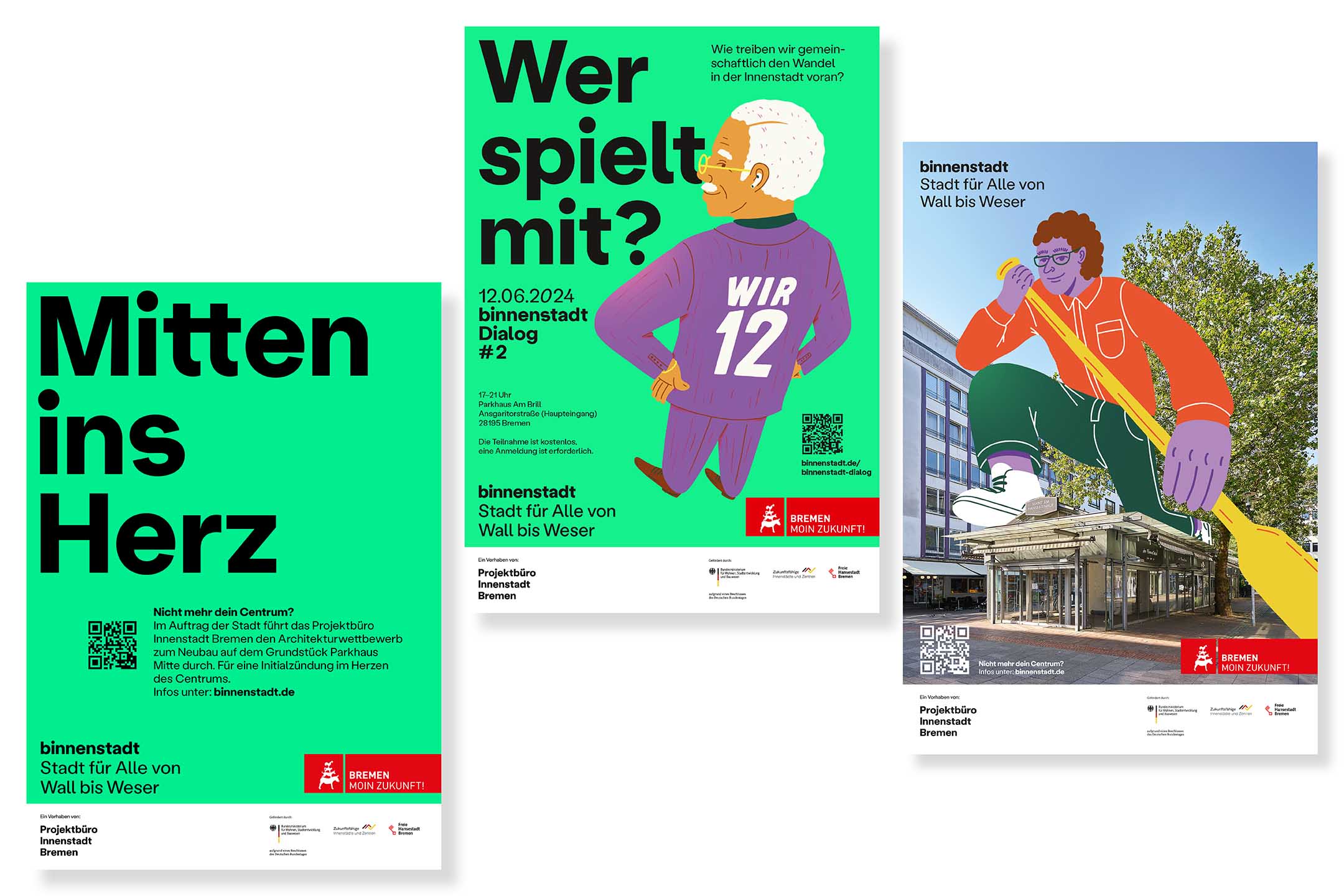
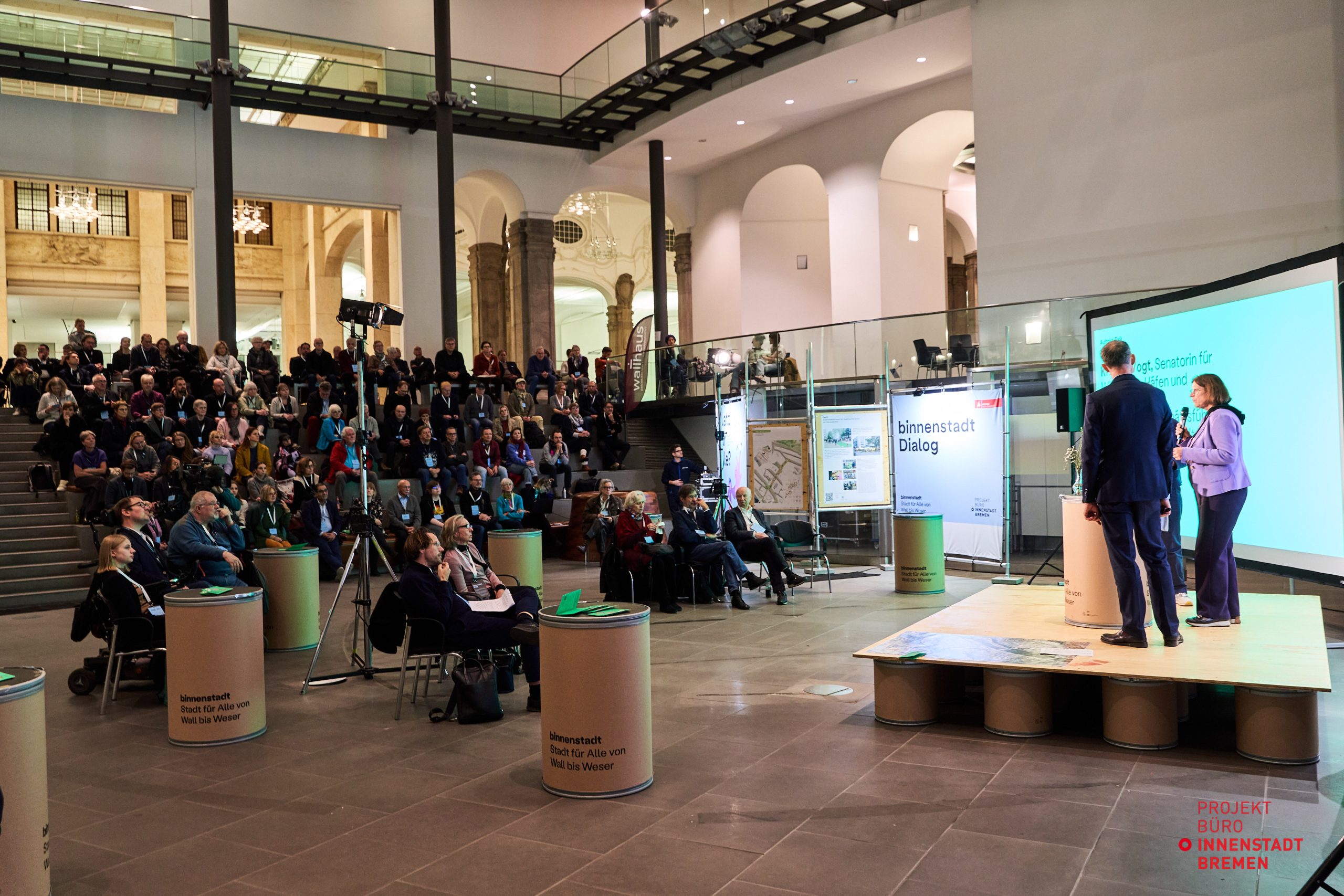
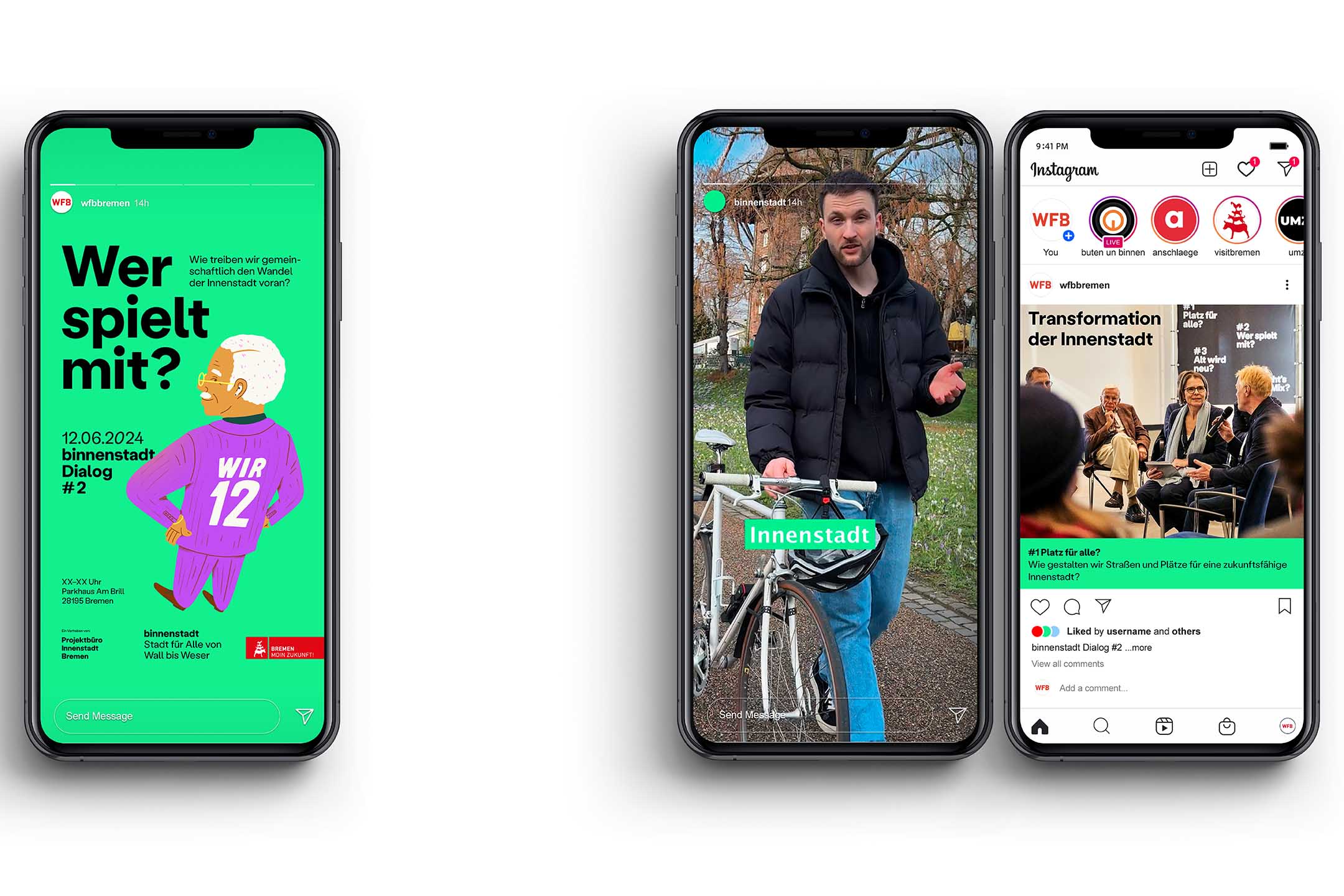
The binnenstadt Dialog is the participatory communication format between the project office and interested members of the public. Four large events take place at unusual locations in Bremen’s city center: an empty savings bank or a parking garage. The key visual for the dialog events shows individual “transformers” that match the individual topics.
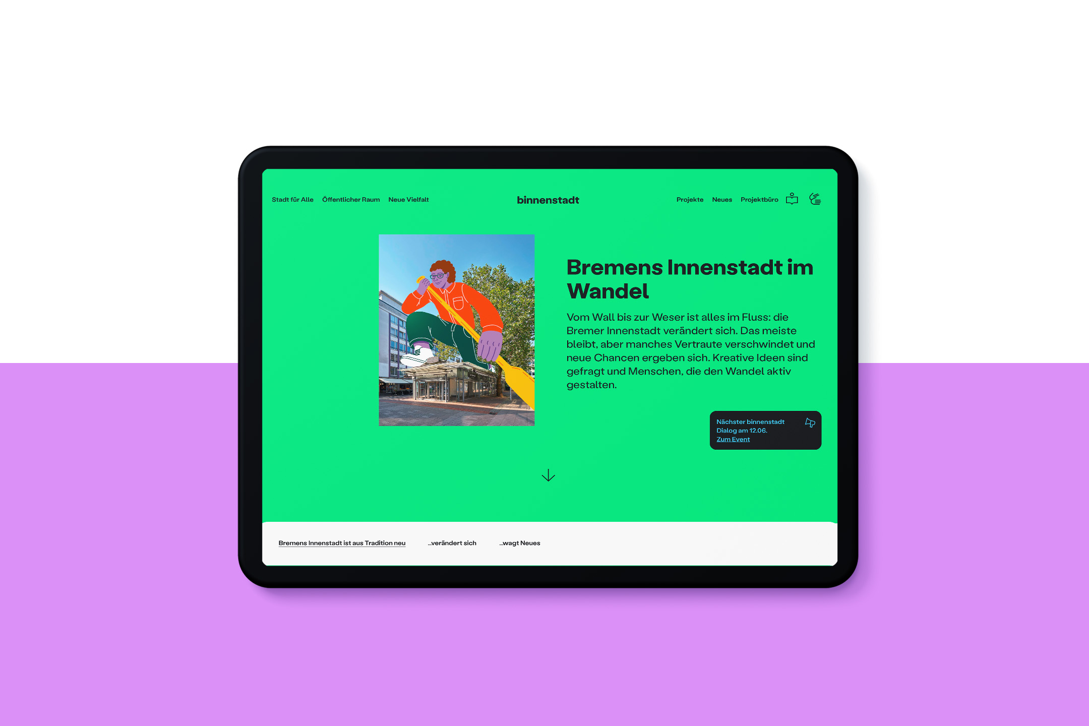
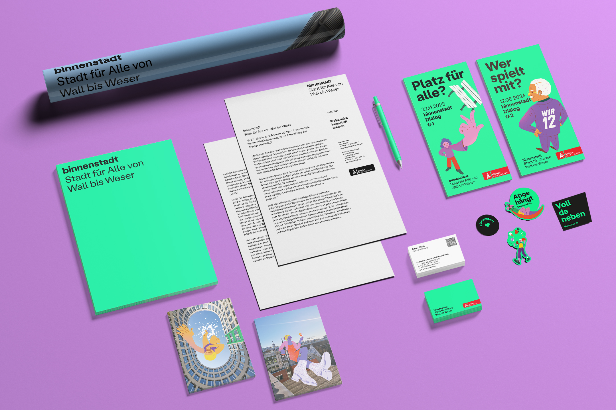
A comprehensive website is the linchpin of strategy, design and campaign. A social media strategy constantly pushes campaigns and thus ensures traffic to the website. Here, users are picked up with scrollytelling on the topic of transformation: What does constant change mean for a place that everyone knows – the Domshof, market square and largest open space. The scrollytelling leads on to the three main themes of “City for all”, “Public space” and “New diversity”. Projects are clearly located using an interactive map and structured chronologically via a timeline. Current articles on all new developments feed the content of the newsletter and social media channel. Reel formats with street interviews, stories about the locations and explanatory videos cover the broad spectrum of cross-media communication.